Project Overview
Foody is a native mobile app designed to help users track their daily food intake, set nutritional goals, and integrate with fitness devices. This case study explores my process from concept through high-fidelity mockups, focusing on modular design and user-centered thinking.
My Role
• UX/UI Designer
• Interaction Design
• Visual Design
• Mobile UX Strategy
Problem
Busy users struggle to keep track of meals and nutrition across fragmented apps. Existing trackers are often too complex, dated, or require too much setup to start.
Goal
Design an intuitive, visually engaging iOS mobile app that enables users to easily:
• Log meals and view nutrition
• Track calories and macros
• Set food goals
• Sync with wearable fitness devices
MVP
To keep the scope focused and deliver value early, I approached Foody as a Minimum Viable Product (MVP). The goal was to launch a lean, functional mobile app that prioritized the most impactful features for the core user journey: logging food, reviewing nutrition, and maintaining consistency.
Personas

-
• Age: 34
• Occupation: Marketing Manager
• Goals: Stay energized throughout the day
• Frustration: Most food trackers feel bloated or overcomplicated

-
• Age: 28
• Occupation: Engineer
• Goals: Track protein and calories for muscle gain
• Frustration: Needs fast access to macros, hates tapping too much
Process
1. Research & Competitive Analysis
I reviewed popular apps like MyFitnessPal and Chronometer, noting common frustrations (cluttered UIs, slow onboarding) and opportunities (better onboarding, modular components, Apple Health integration).
2. User Flows
Mapped out core flows including meal logging, goal setting, and account creation.
3. Wireframes
Focused on clarity and hierarchy in early screens, testing layout before committing to style.
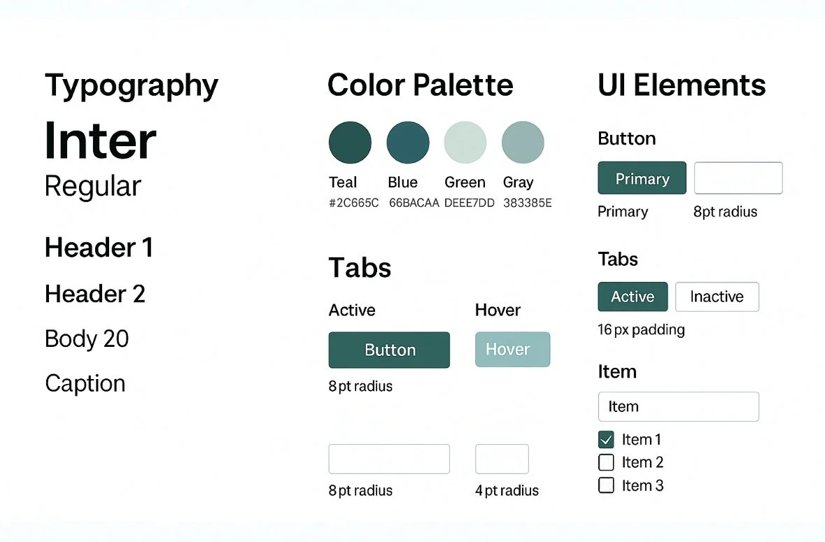
4. UI Design & Branding
Selected a modern, friendly palette and clean typography (Inter). Created modular UI elements like nav bars, charts, and meal cards.
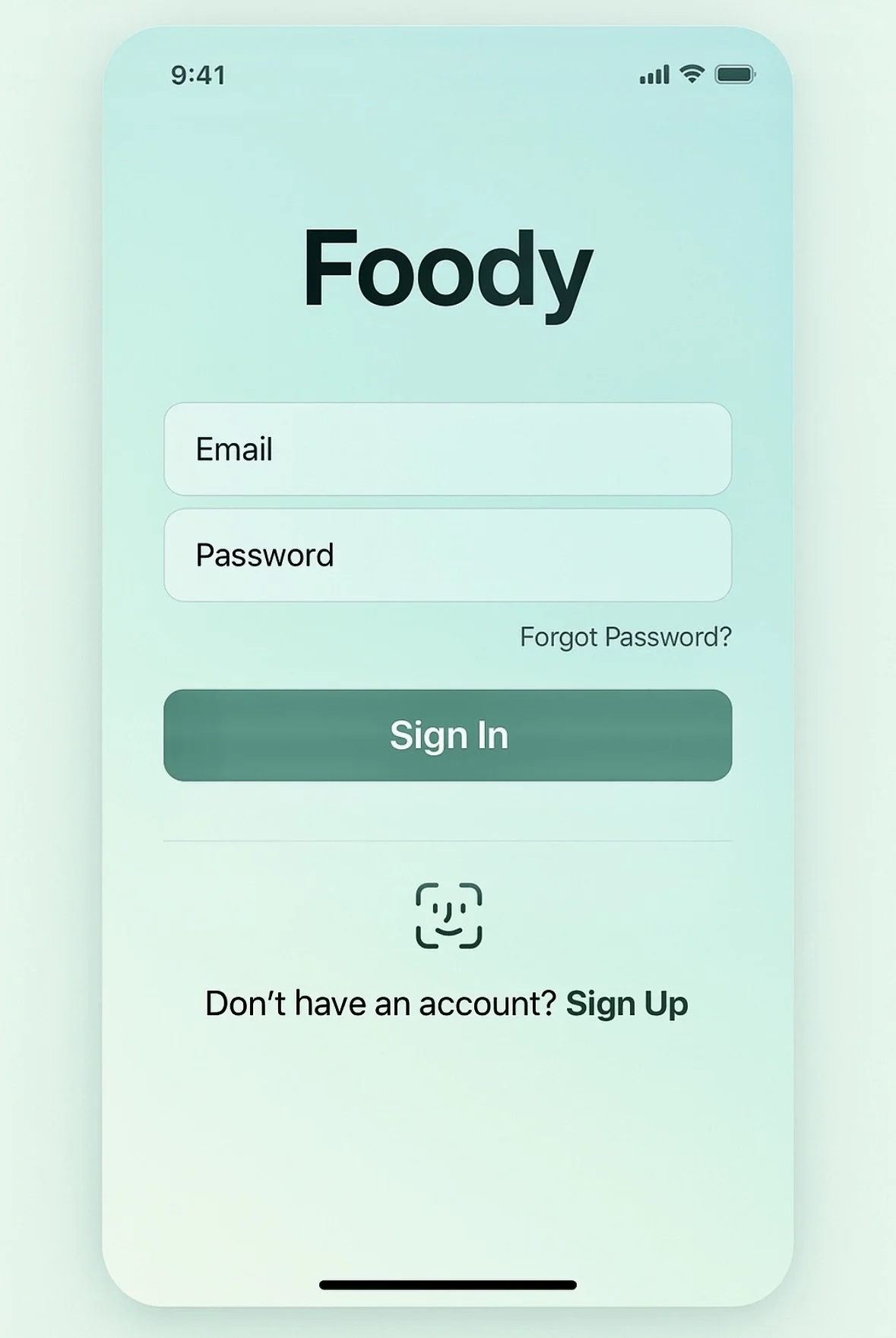
5. High-Fidelity Mockups
From onboarding to detailed nutrient charts, the designs emphasize ease of use and visual clarity.
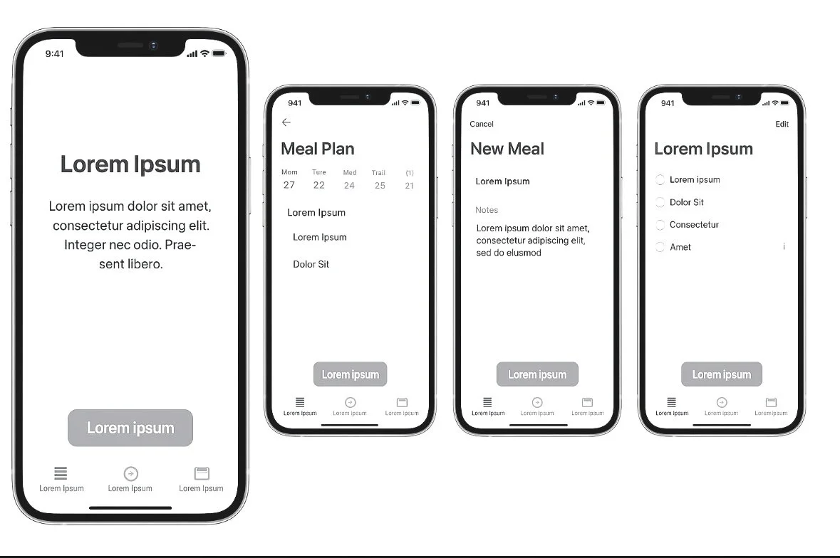
Low fi iterations allow for quick and easy changes
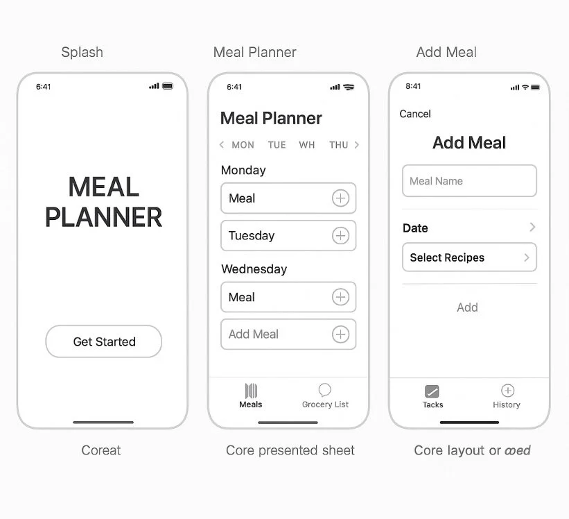

Using placeholder text allows me to quickly iterate in low fidelity. I can quickly test the mockups and UX of the app to make sure that the architecture is valid and no additional changes are needed before investing more time on additional polishing of the designs.
If time is available, I like to do a quick set of mid level wireframes to test colors, layouts and reassess any of the previous changes.
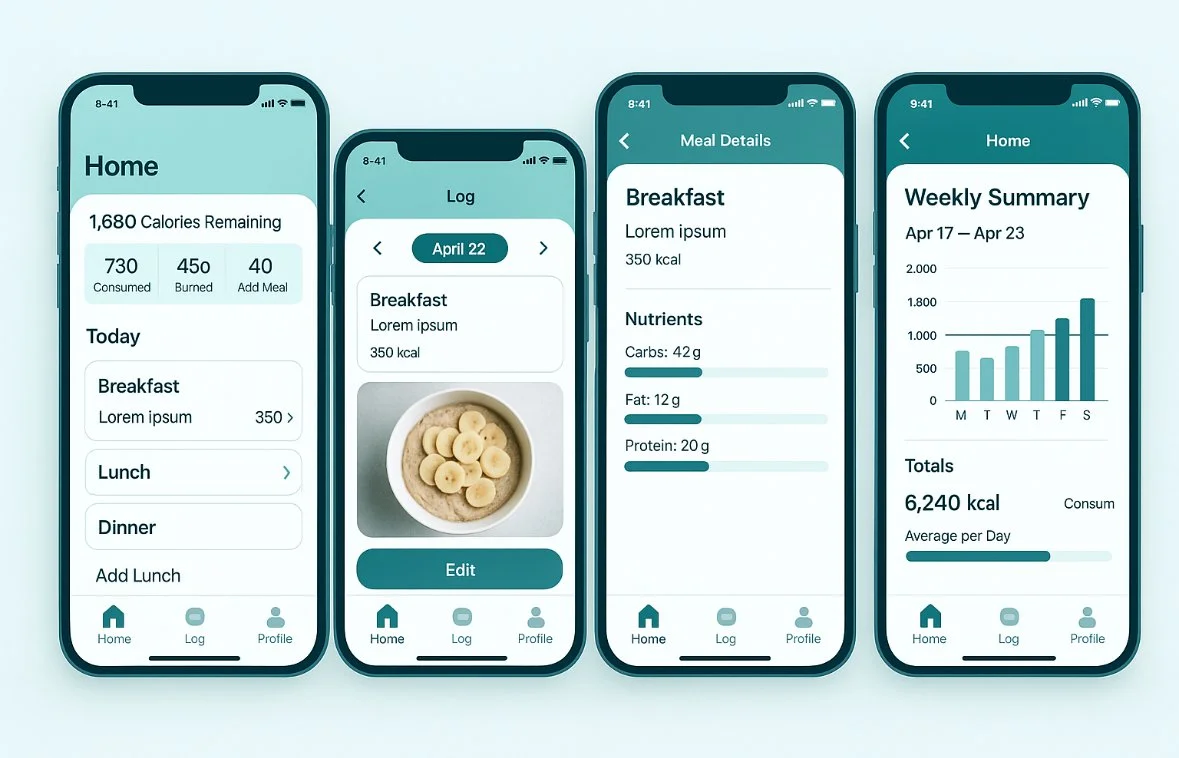
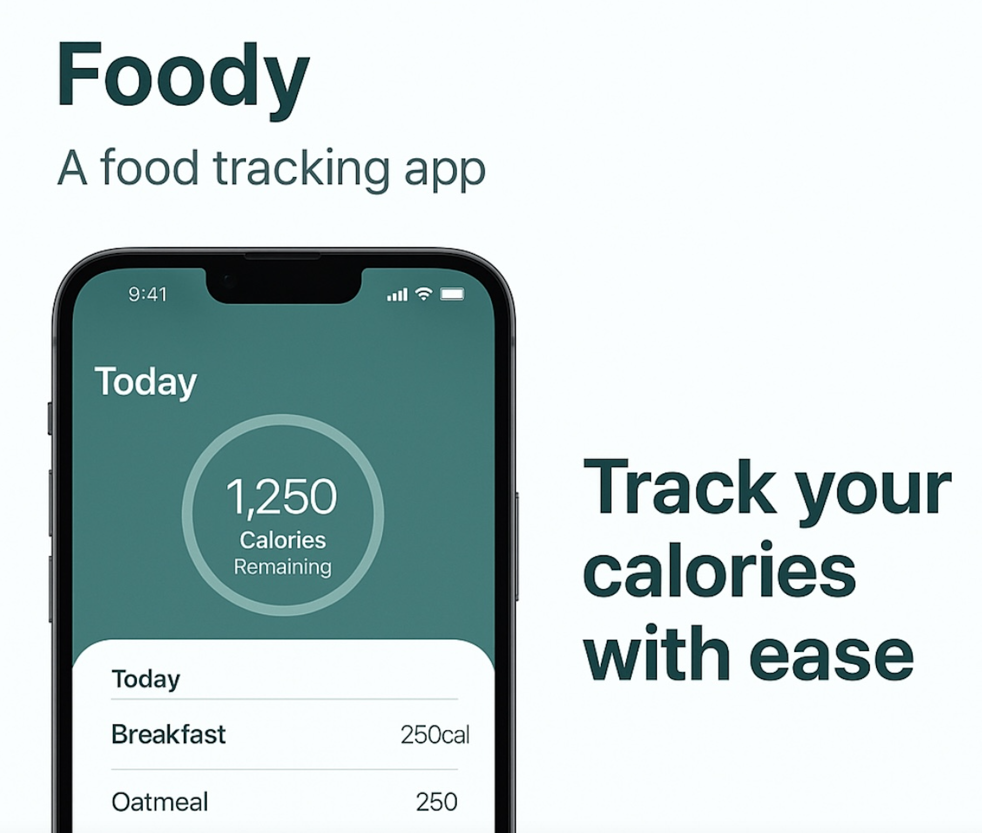
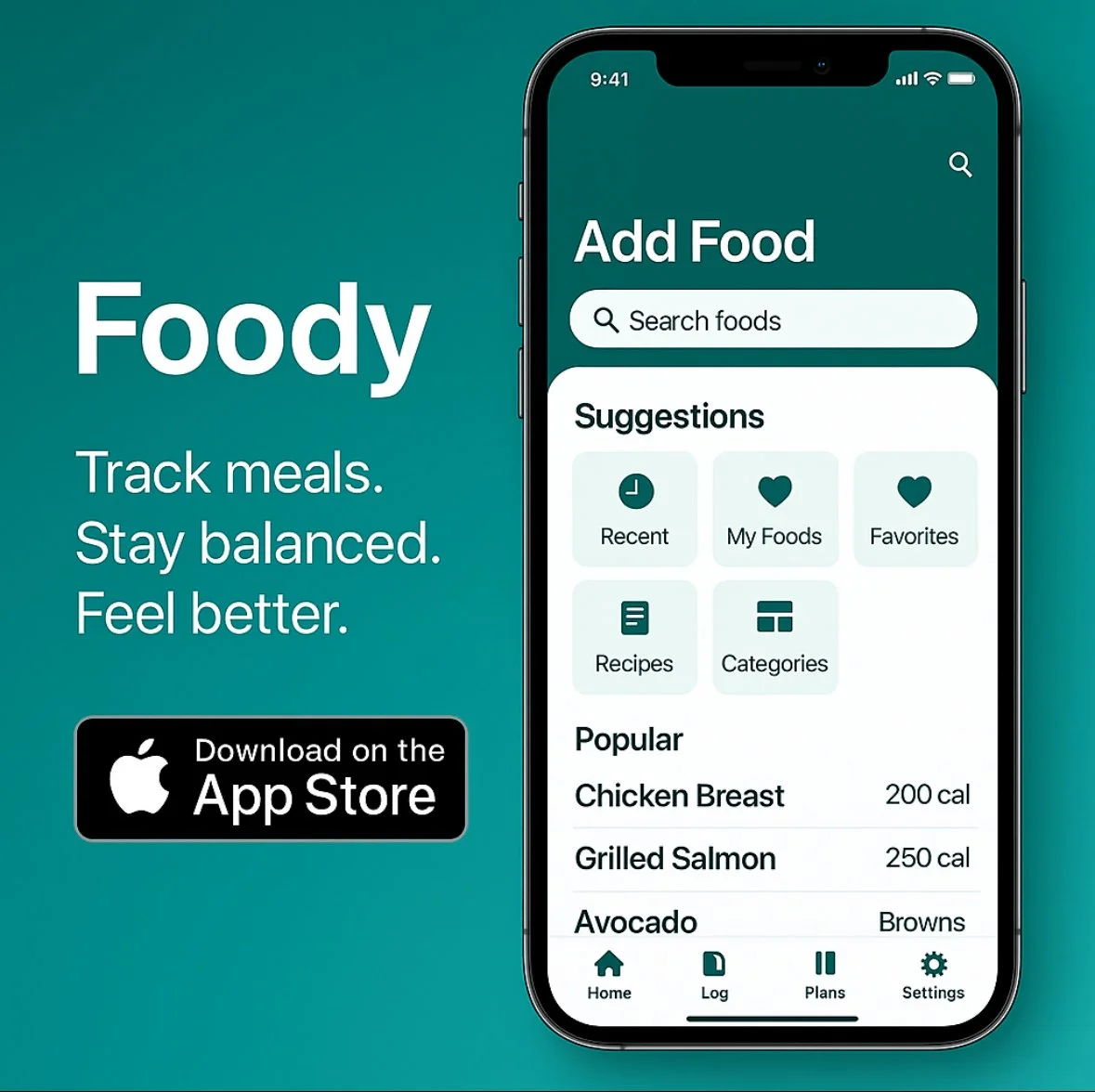
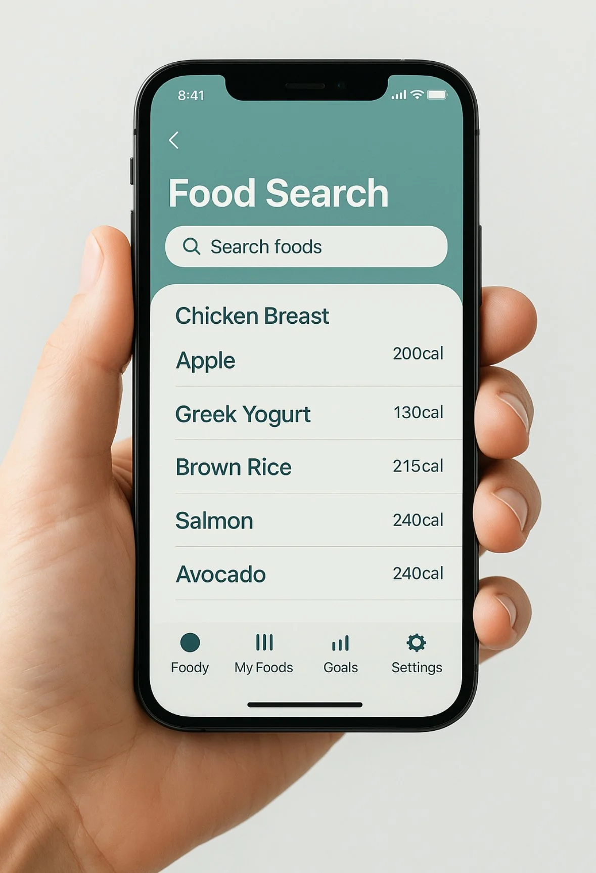
Key Screens
-
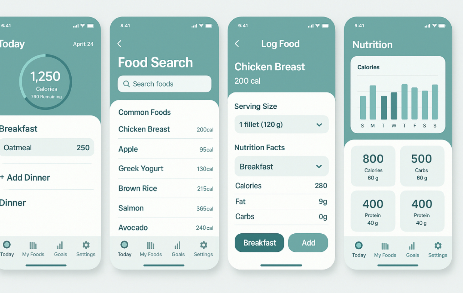
Shows calories remaining, meals overview.
-
Tap-based flow to add foods quickly.
-
Includes common foods and recent items. Allows for custom food input.
-
Visual graphs for calories, protein, fat, carbs.
-
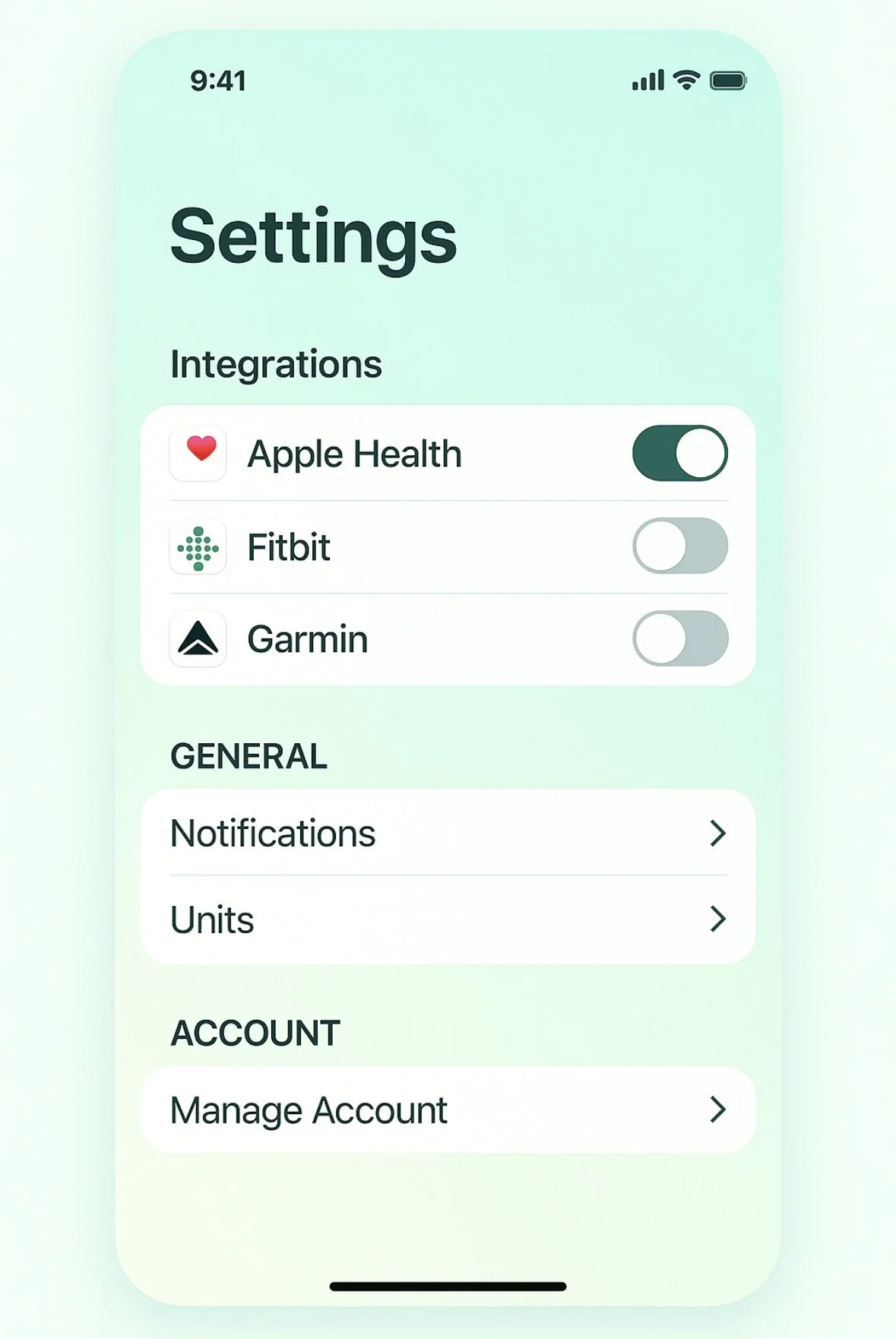
Connects with Apple Health, Fitbit, Garmin. Allows user to edit app settings.

Results & Reflections
• Design system allowed for scalable UI across features
• Improved hierarchy helped reduce cognitive load during testing
• User flow clarity helped smooth onboarding and daily usage
If built, this would integrate easily with iOS HealthKit and Apple design standards
Tools Used
• Figma
• Apple Human Interface Guidelines